本笔记来源于B站Up主: 有Li 的影像组学系列教学视频
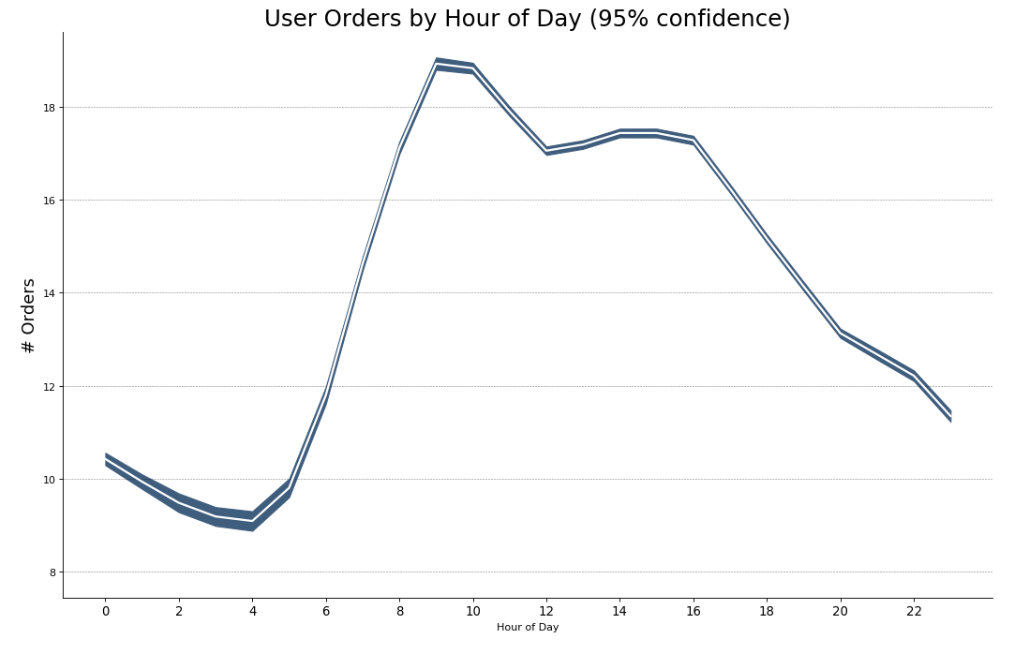
本节(44)主要内容:带95%置信区间的折线图
Method 1
# Time Series with Error Bands
## In this approach, the mean of the number of orders is denoted by the white line.
## And a 95% confidence bands are computed and drawn around the mean.

from scipy.stats import sem
import pandas as pd
import matplotlib.pyplot as plt

# Import Data
df = pd.read_csv("https://raw.githubusercontent.com/selva86/datasets/master/user_orders_hourofday.csv")
df_mean = df.groupby('order_hour_of_day').quantity.mean()
df_se = df.groupby('order_hour_of_day').quantity.apply(sem).mul(1.96)

# Plot
plt.figure(figsize=(16,10), dpi= 80)
plt.ylabel("# Orders", fontsize=16)
x = df_mean.index
plt.plot(x, df_mean, color="white", lw=2)
plt.fill_between(x, df_mean - df_se, df_mean + df_se, color="#3F5D7D")

# Decorations
# Lighten borders
plt.gca().spines["top"].set_alpha(0)
plt.gca().spines["bottom"].set_alpha(1)
plt.gca().spines["right"].set_alpha(0)
plt.gca().spines["left"].set_alpha(1)
plt.xticks(x[::2], [str(d) for d in x[::2]] , fontsize=12)
plt.title("User Orders by Hour of Day (95% confidence)", fontsize=22)
plt.xlabel("Hour of Day")

s, e = plt.gca().get_xlim()
plt.xlim(s, e)

# Draw Horizontal Tick lines
for y in range(8, 20, 2):
    plt.hlines(y, xmin=s, xmax=e, colors='black', alpha=0.5, linestyles="--", lw=0.5)

plt.show()
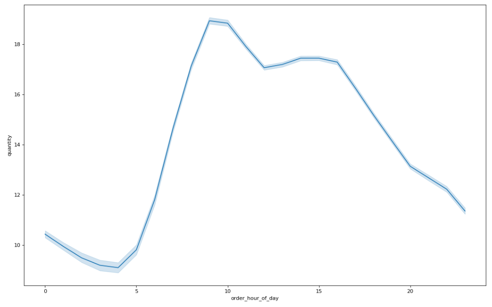
Method 2 (Seaborn package)
import seaborn as sns
import pandas as pd
import matplotlib.pyplot as plt

df = pd.read_csv("https://raw.githubusercontent.com/selva86/datasets/master/user_orders_hourofday.csv")

plt.figure(figsize=(16,10),dpi = 80)
x = df["order_hour_of_day"]
y = df["quantity"]
sns.lineplot(x,y,ci=95
#,err_style=None
            )

plt.show()
示例数据的模样:

参考资料:
Top 50 matplotlib Visualizations – The Master Plots (with full python code)
End
李任远博士在B站发布的影像组学视频教程系列正式结束啦~~今后将带来关于脑功能磁共振与深度学习的更多内容,敬请关注。对影像组学科研有进一步学习、指导需求的,欢迎加入我们的付费手把手课程,详情可以点此前去查看。